ShopDreamUp AI ArtDreamUp

Deviation Actions

Private collection, please do not unlock
private drawings such as sketches, portraits and various handmade drawings. Due to the fact that it is not possible to hide folders, I decided to use this form of collecting my works
$100/month


Suggested Deviants


Suggested Collections


You Might Like…


Description
"Richer and cleverer than everyone else!"
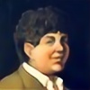
Locke and Jean on the roof of Perelandro's temple, during their apprenticeship. One day they will get on one of these towers...
Characters and setting belong to Scott Lynch.
Locke and Jean on the roof of Perelandro's temple, during their apprenticeship. One day they will get on one of these towers...
Characters and setting belong to Scott Lynch.
Image size
1366x728px 100.95 KB
© 2015 - 2024 TolmanCotton
Comments3
Join the community to add your comment. Already a deviant? Log In
Another Gentleman Bastards fan here! You've chosen a great scene from the book to illustrate so let's see if I can't offer some advice to improve it's impact.
My first thoughts are always about composition. In your image everything of importance is on the right half of the image so I'm prone to think the image wouldn't suffer any from cropping off the left half.
I think a big part of the impact of this scene is the fact that these are children so many of the details should help to make this clear. I wouldn't crop the towers in the background like currently. I'd push the top edge of your canvas up to let those towers get even taller and therefor making the characters seem smaller. Right now the towers are tall but you want viewers to go , "got daaaaang that's some TALL towers!" Really push it to be almost absurd. I like the fog/dust atmosphere that's hiding the bottom of the towers! Don't be afraid to let it completely hide the bottoms and then it's even cooler when the towers emerge from it higher above. Also vary the heights of the towers to add interest.
Kids are tricky to illustrate because their proportions are strange. They're freaky really, so get some reference for this part of the image. Make sure to put them in baggy ill-fitting clothes because it will make them seem even more childlike and poor like these characters were. With the slope of the roof I would actually put Locke on the left and Jean on the right. Locke is the leader so having him above Jean feels more right to me and Jean lower would make it feel like Jean is keeping Locke from sliding off the page. Which also fits Jean's roll of protector. You have been subtle with showing the difference in size between the two but I would push it more. At this point Jean isn't a bruiser so much as big and fat so really make him rotund with no neck. Maybe give Lock short sleaves to show how he's rail thin.
The buildings between the towers and the characters could use more attention. On the characters and the moons you have shown that you understand how to account for the angle of the sun and where light would hit but on some of those buildings you have drawn around shapes with yellow.
I hope that I've been of some help.